



Glassnode Says Bitcoin Flashes Momentum Signal Seen at Start of Last Two Bull Markets.
Bitcoin has recorded a fresh shift in a closely tracked on-chain valuation metric, with Glassnode data showing MVRV momentum moving back into positive territory.
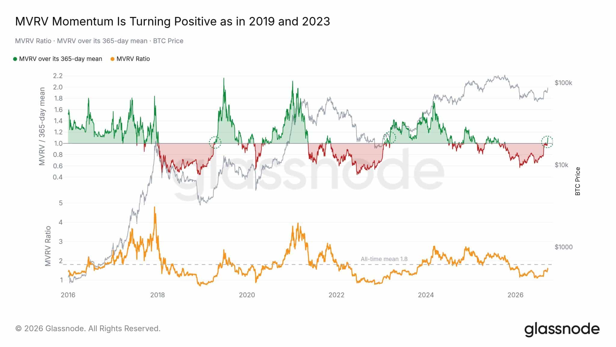
The latest Glassnode chart shows Bitcoin’s MVRV Ratio crossing back above its 365-day moving average. Glassnode defines its MVRV Momentum Oscillator as the MVRV ratio divided by its one-year moving average, minus one. A reading above zero therefore means MVRV is trading above its annual trend.
Glassnode Chart Analysis in Detail
Glassnode chart covers roughly 2016 through 2026 and combines three pieces of information: Bitcoin price, the MVRV Ratio, and MVRV’s position relative to its 365-day average.
The important development is at the far right: MVRV momentum has just moved back above its one-year baseline, producing a transition that visually resembles the marked 2019 and 2023 crossovers.
1. What the upper panel is showing
The grey line is Bitcoin’s price, read against the logarithmic scale on the right. The colored series measures MVRV relative to its 365-day mean.
The horizontal 1.0 line is the key dividing point. When the series is green and above 1.0, MVRV is above its 365-day average. When it is red and below 1.0, MVRV is below that annual baseline.
At the far right of the chart, the indicator has climbed out of the red region and is crossing approximately 1.0. Glassnode circles this transition in green.
This does not mean MVRV itself equals 1.0. It means MVRV divided by its 365-day mean is approximately 1.0—in other words, MVRV has caught up with its annual average.
2. Why 2019 is highlighted
The first dotted green circle appears around 2019.
Bitcoin had already experienced the major 2018 bear-market decline. During that period, MVRV momentum spent considerable time below 1.0, shown in red.
Around 2019, it recovered through the 1.0 threshold. The indicator then accelerated well into the green region while Bitcoin simultaneously moved out of its bear-market lows.
So the chart is using 2019 as an example of a transition from negative MVRV momentum → crossover → positive MVRV momentum.
3. The 2023 comparison
The second highlighted transition occurs around 2023, following Bitcoin’s 2022 decline.
Again, MVRV momentum had spent an extended period below its 365-day mean. It subsequently crossed above 1.0 and turned green.
Bitcoin’s price was around the lower portion of its post-2022 recovery at that stage. The indicator remained predominantly positive during much of the subsequent expansion into 2024.
The common sequence displayed for both 2019 and 2023 is therefore:
extended red period → recovery toward 1.0 → crossover → green/positive MVRV momentum → major BTC price expansion afterward.
4. What happened through 2024–2026
This section is particularly important because the current signal did not appear immediately after Bitcoin’s previous major advance.
MVRV momentum was strongly positive during parts of 2023 and 2024, at one stage reaching roughly 1.6–1.7 relative to its annual mean.
Momentum subsequently weakened. There were several movements around the 1.0 boundary before a more persistent deterioration developed into 2025–2026.
The indicator eventually fell toward approximately 0.6, representing one of the deeper negative readings visible in the recent portion of the chart.
It has now recovered sharply from that depressed area back toward and slightly through 1.0.
That is the change Glassnode is highlighting.
5. The lower MVRV panel adds important context
The orange line is the actual MVRV Ratio rather than its momentum relative to the annual average.
The dashed horizontal line at approximately 1.8 is explicitly labeled the all-time mean.
The current MVRV Ratio appears around 1.5–1.6, meaning it remains below the displayed historical average even as its momentum measure turns positive.
This distinction matters.
The chart is not showing MVRV at historically extreme levels. Instead, it shows MVRV recovering sufficiently to overtake its own 365-day average.
Earlier major market peaks had much higher readings. MVRV reached above 4 around the 2017 peak and approached approximately 4 again around 2021. The present reading is considerably lower.
6. What the latest section says about Bitcoin’s market cycle
From a market-cycle perspective, the chart shows three stages in the recent sequence.
During the 2025–2026 weakening period, MVRV momentum dropped below its annual trend and remained predominantly red. That corresponds to the contraction/markdown portion of the valuation cycle.
The bottoming and sideways portion of the indicator represents stabilization and potential re-accumulation.
The latest movement through 1.0 is the first evidence on this particular metric of a transition from that negative regime toward a positive momentum regime.
The important distinction is that this is a momentum crossover, rather than an MVRV valuation extreme.
7. Why Glassnode compares the present setup with 2019 and 2023
The similarity is specifically in the structure of the indicator, not an assertion that Bitcoin must reproduce the exact price path of either year.
All three highlighted areas contain the same basic event: MVRV was below its 365-day mean and subsequently recovered through it.
In 2019, the transition came after the 2018 bear market.
In 2023, it came after the 2022 bear market.
In 2026, the chart shows the indicator making the same type of transition after an extended period of negative momentum.
That is why the chart title says “MVRV Momentum Is Turning Positive as in 2019 and 2023.”
Bottom line from the chart
The most significant information is not simply that MVRV is rising. It is the combination of three visible facts: MVRV momentum recovered from roughly 0.6, reached the 1.0 regime boundary, and has begun crossing above its 365-day mean while absolute MVRV remains below its displayed 1.8 historical average.
On the historical examples selected by Glassnode, the comparable 2019 and 2023 crossovers occurred near major transitions from depressed/contracting market conditions into subsequent expansion phases. The 2026 chart has now reached that same indicator threshold; the future price path drawn from here is not contained in this chart.